 Mapumental is a start up of mySociety, the organisation that builds award-winning non-profit websites and carries out commercial work for clients such the BBC, The Guardian, Google, and national and local government. In 2007 the project started develop prototypes for real time maps that could handle huge amounts of travel data. In 2009 it won an investment loan from Channel 4 and Screen West Midlands to build a prototype tool, and, in 2010, a full version of Mapumental.
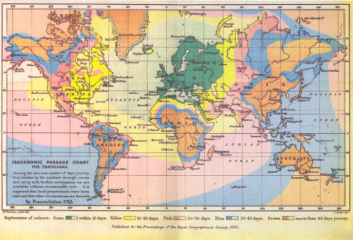
In 1881, Francis Galton, FRS, made an “Isochronic Passage chart for passengers” showing the shortest travel times between the UK and the rest of the world. The result was a beautiful map showing the world divided into five timebands. They ranged from “within 10 days” to “more than 40 days”.
It is a daunting reminder of how much travel has changed. With the aid of this map, one can see at a glance which parts of the world were, to most people, entirely inaccessible – who could spare 40 days to visit deepest Africa, far away China or the South American interior?
As it happens, this map was not the impetus for Mapumental – we only saw it after our technology was created. But Mapumental is a project which sets out to do much the same for the modern age, albeit restricting its boundaries to those of Great Britain, and with time bands calculated in minutes rather than days. With a Mapumental map, you can see how long it would take to travel by public transport anywhere within great Britain, from any given postcode.
We don’t know what data Galton used for his chart – presumably, shipping timetables. In today’s world, with its multitude of routes and different forms of transport, something a little more complex was required.
An isochronic chart for the modern age
Mapumental’s travel time visualisations use the National Public Transport Data repository, which is available to anyone for public or commercial use, under the Open Government licence. The repository provides an annual snapshot of all public transport journeys in Great Britain.
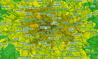
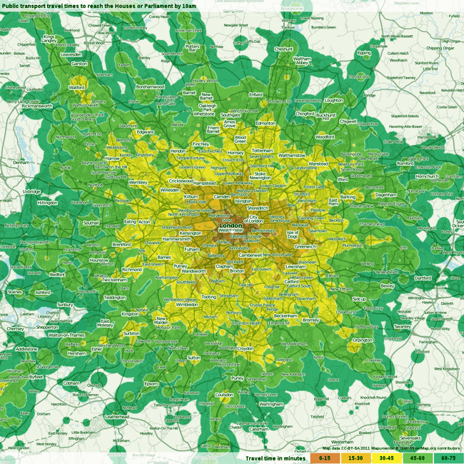 Fig. 1 – Static map: travel times to Parliament
The project was developed by mySociety, a UK organisation with a remit to build websites giving people tangible benefits in their civic and political lives. mySociety has long campaigned for the free availability of data sets to enable public and private organisations to create innovative tools and applications.
Previous mySociety projects relied heavily on publicly-available maps, postcodes and public transport timetable data, so our developers already had a wealth of experience in putting such elements together to make useful online tools.
Beginnings
The seed of the idea was planted in 2006, when the Department of Transport approached mySociety to ask them to explore new ways in which public transport data could be used. Naturally, we were keen to show just what could be done with publicly-available data of this kind.
We knew that travel times and geographical distance did not always correlate – thanks to factors such as high-speed train lines and the quality of connections, strange anomalies can emerge. And so the idea behind Mapumental was formed: maps that would take public transport data and display, simply and graphically, the travel time from a start point to everywhere on the map.
An early prototype
At that time, we described the project thus:
“Transport maps and timetables help people work out how to get from A to B using buses, trains and other forms of public transport. But what if you don’t yet know what journey you want to make? How can maps help then?
This may seem a strange question to ask, but it is one we all face in several situations:
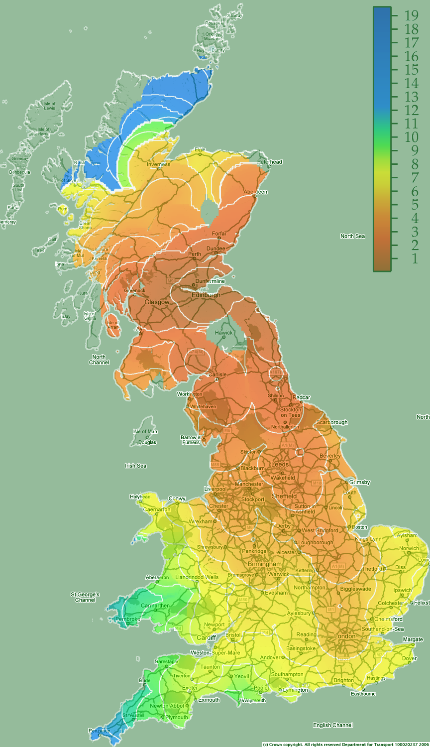 Fig. 2 – 2006 rail travel time map, from Edinburgh Waverley
Here is an early example of one of the first maps our late friend and developer Chris Lightfoot produced back in 2006 [fig 2]. It shows travel times by rail from Edinburgh’s Waverley station. The white contour lines are drawn at one-hour intervals, so the innermost contour shows destinations up to an hour from Edinburgh, the concentric one two hours, and so forth.
The effect of the East Coast Main Line is clear to see: it appears as a tendril of red and pink stretching south from Edinburgh down to London.
The analysis of journey times from a start point to every point on the map one at a time would be very slow indeed, so the public transport travel times in these maps are calculated all at once using a variation on Dijkstra’s Algorithm. This works roughly by starting at a place on the map, and looking for all public transport stops within an acceptable walking distance. From those stops, journeys to everywhere you can get by public transport are followed, and so on until you have found every reachable bus stop and train station.
But calculating the travel times is only part of the problem – next comes drawing the actual map. In the case of public transport, the output of the Dijkstra’s Algorithm calculation is taken and, using an approximation for walking speed, the places around the public transport stops are then filled in with an appropriate colour.
Those early maps struck a chord with many: the interest was so great that we continued to develop the project. Attractive though those early maps were, they were not always easy to read and use, so we worked with design company Stamen to increase the clarity, and to develop prototypes for an interactive mapping tool.
At the same time, we were including other datasets into the mix – house prices and car travel times, for example – even “picturesqueness”, using data via our online rating game Scenic or Not.
Dynamic Mapumental tool
The early maps also took a great deal of manual work to create, so it was vital that while working on these improvements we also found ways to generate them more quickly. In 2008, a proposal to Channel 4’s innovation fund won us a commercial investment award to build a dynamic web tool that created the maps automatically.
By 2009, we had an interactive demo service online: via slider tools, users could adjust a number of different metrics and see the results instantaneously.
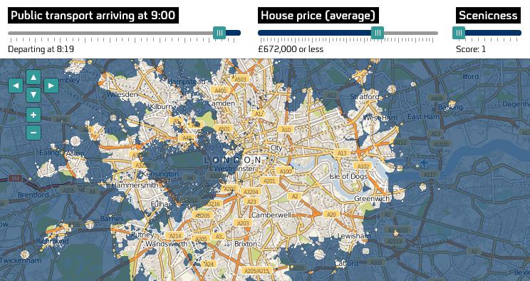 Fig. 3 – Mapumental web tool interface snapshot
The public transport calculations need to be done for every place you are interested in travelling to or from, and require a lot of computing power. To cope with lots of web users entering their own starting place and time at once, we moved to a new architecture of having a group of servers doing the Dijkstra’s Algorithm calculations which can be automatically scaled to react to current demand.
It had been clear to us from the start that the maps would have many uses for property-hunters and job-seekers, and as Mapumental developed, we realised that there were many other potential applications too.
Businesses looking to relocate would be able to concentrate their premises search in only those areas their workforce could reach within a short commute. Public service providers could similarly determine where best to locate services for greatest accessibility. These analyses would become even more powerful if Mapumental was combined with demographic data.
Additional applications that we are exploring include :
The Channel 4 funding requirements stated that we had to find a commercial application for the project, and so we now offer this technology on a commercial basis to both public and private organisations. The website for Mapumental products is: http://mapumental.com
Static travel time maps
The dynamic tool is useful when one is sitting in front of it and exploring; however, in many situations the simple static images of travel times are much more useful. For example, if you offer listings of properties, or jobs, by including an image to each listing you can show commuting times quickly and easily without the need for any complex and bandwidth-heavy tools. For venues, hotels, universities and the like, static maps can show travel times in a way that is very helpful to visitors.
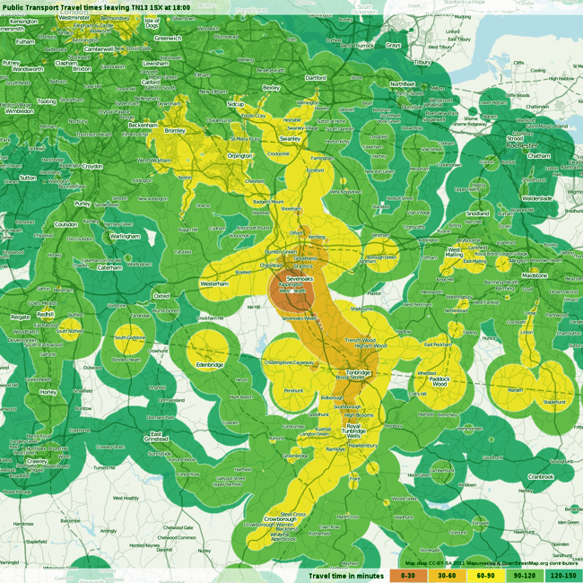 Fig. 4 – Map showing travel times from a Sevenoaks residential development, leaving at 6pm and travelling for no more than 150 minutes
Therefore, we found a way to produce static map images that can be published on websites, shared by email or stored on a computer. You can see some examples here: http://shop.mapumental.com/samples/
The service only launched a few weeks ago – among our first users were urban planning consultants, analysing accessibility for proposed developments to support planning applications, individuals who ordered maps for their homes, and companies to put these on their corporate websites.
In addition to the online ordering system we have created an API for high-volume users, which allows generating large quantities of maps very quickly. Our first client for this API was the property chain Foxtons, who now display a Mapumental map beside every property listing.
Summary
Visualisation of travel times, using open data and web-based tools, creates new opportunities for individuals, and public and private organisations. It makes it easy to analyse commuting times without specialist software or expert skills.
It can open up new possibilities for house and job hunters, while saving them research time. It can also help in planning developments and services that are easily accessible to those using public transport. Combined with demographic data, Mapumental would be very useful for both public and private sector location planning.
mySociety is open to future collaboration, especially with funding partners. Now that the Mapumental technology has been built, the possibilities for including other data layers are endless – that might include other travel modes such as driving and cycling, or data such as health statistics or crime figures.
———————————————————————————————-
Myf Nixon is Marketing and Communications Manager at mySociety.
For more information: Mapumental
