 Recently, I was asked if I would teach a Google SketchUp course to a group of planners. I’d put together similar courses in the past, with the objective of giving a basic understanding of 3D concepts and workflows. Always on the ready to exploit any opportunity that spreads knowledge about the power of 3D, I agreed without hesitation. SketchUp is a good, and easy to learn, tool for planners to explore massing options, test shadow impacts, and other simple design related issues. This course turned out to be unexpectedly different. While what they were learning would still be applicable to a range of urban design related projects, the focus of the course wasn’t about using SketchUp as a design development or analysis tool. Why they wanted to use SketchUp caught me completely by surprise.
Recently, I was asked if I would teach a Google SketchUp course to a group of planners. I’d put together similar courses in the past, with the objective of giving a basic understanding of 3D concepts and workflows. Always on the ready to exploit any opportunity that spreads knowledge about the power of 3D, I agreed without hesitation. SketchUp is a good, and easy to learn, tool for planners to explore massing options, test shadow impacts, and other simple design related issues. This course turned out to be unexpectedly different. While what they were learning would still be applicable to a range of urban design related projects, the focus of the course wasn’t about using SketchUp as a design development or analysis tool. Why they wanted to use SketchUp caught me completely by surprise.
My session was part of an ongoing course to teach drawing skills, and SketchUp’s supporting role was to provide a way to quickly generate basic massing and context that could be printed out, and then used as an underlay for producing the final product – hand drawn sketches. Hand drawn sketches – in 2011?
I felt a little uncomfortable about seeing SketchUp, given all its power, being relegated to this minor and possibly even inappropriate role. OK, maybe I’m a wee bit touchy when it comes to 3D, given my belief that proper 3D practices will bring about world peace if not the singularity. It is difficult enough getting people to move on from work practices rooted in the last century, let alone having to deal with how they did things in the century before that. Was I being heretical to let SketchUp be used in this manner?
3D Changes Things
Not that there is anything wrong with drawing; there is nothing more delightful, or often informative, than a well-executed architectural sketch. (Full disclosure – my circuitous path to my current role in GIS and city modeling began with an education in both fine art and architecture, so I have been known to indulge in sessions of pencil and paper myself.) I guess what was really bothering me is that I’ve seen how powerful things will be when GIS, BIM and visualization really start to converge.
Why would anyone create new data (a sketch) that is, by nature, not very accurate or quantifiable, and can’t be reused, queried, analyzed, or translated (I don’t think there is a FME transformer for a pencil drawing to SHP quite yet)? What is the role for sketches in our current and emerging, design and review processes? Thinking about this made me realize how fundamentally things change when 3D enters the picture. Confidence in what we have understood data to be (especially from a GIS perspective) starts to waver.
The differences between GIS data and 3D began to stand out when I was exposed to Autodesk’s LandXplorer. The emergence of a piece of software that enabled me to work with both 3D and GIS data concurrently was both exciting and illuminating.) While I’d used both GIS and 3D modeling software independently for many years, and may have had fleeting thoughts about how great it would be to be able to have a single application that shared the functionality of both, I didn’t really expect it to ever happen. These were two very different worlds with very little overlap. Now, such a convergence of functionality seems so logical and sensible, and I expect this type of convergence product will eventually displace discrete GIS and 3D software for many purposes, especially when working with urban built form and infrastructure data.
While I look forward to the eventual marriage of GIS and visualization, it is still early days; the pair are still just getting to know one another. I don’t want to trivialize what a major step forward it is to be able to, for example, accurately place our GIS derived street network into our 3D downtown building massing. But, while coexisting in a common environment, the two types of data remain very different.
Abstract vs. Representational
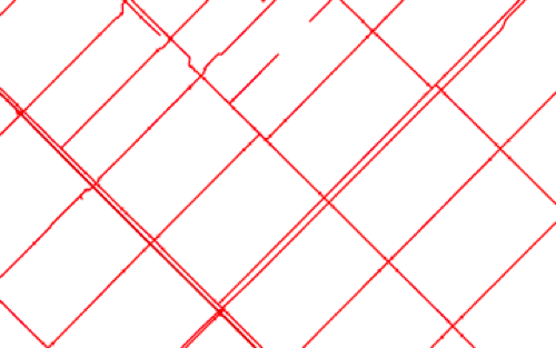
Oversimplifying things, and borrowing from what remains of my fine art education, let me classify GIS data as “abstract”, and 3D data as “representational”. Consider the following figures as examples. Does (Figure 1) (abstract GIS data) represent a street network, sewers, water pipes, or underground cables?

Figure 1: Abstract GIS Data.
Even if I tell you that it illustrates sewers, or if you checked linked attribute data to confirm they are sewers, they still don’t look like sewers; sewers I’ve seen are big, round, and extremely nasty, and not at all like clean, precise thin red lines in the diagram. This sort of visual shorthand has evolved over years and years of practice, and is, for the most part, a closed language understood well only by the practitioners. It was the way to represent things for a long time because of the limitations of available technology, not because there was something inherently superior with this abstraction.
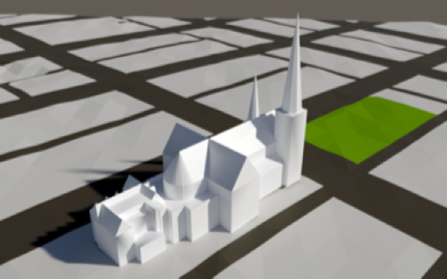
Now consider the following Figure 2 with representational data.

Figure 2: Representational 3D data.
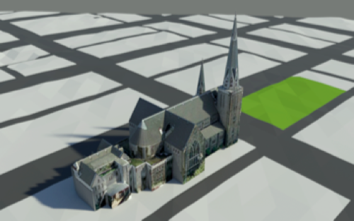
I think just about everyone would be able to identify it as a building, and because of its form, a church. Add a photographic skin to its geometry (Figure 3) and its Gothic style also becomes apparent, as does information about materials, building condition and other elements.

Figure 3: 3D data with photographic skin.
Residents might even be able to identify exactly which church it is. The abstract data type requires attributes, the representational type explains itself. Neither of these two types is superior, and can be complementary. The two ways of representing data are just different, each with its own limitations and advantages. A well-done sketch can convey as much information as an object with a thousand attributes.
The Ease of 3D
As I say to anyone who stays still long enough to listen, “2D is hard, 3D is easy”. It isn’t difficult for a GIS professional to quickly produce diagram one, and other professionals won’t have a problem understanding it. However, if the information is being presented to the public, a fair amount of explanation will likely be needed to ensure there is no confusion. Even with an explanation, it is still likely that each person will have a different image of what an 18” diameter pipe actually looks like.
If we are now able to create a 3D model of a sewer pipe, is it foolish, or stubborn, to continue to represent it a thin red line? Thinking about other abstract representations of data, there aren’t many Pitman Shorthand practitioners around anymore. Yes, representational data can require a substantial amount of work to generate, but if the end objective is to communicate efficiently, especially to the general public, it is well worth the effort. It makes sense to me that we, the professionals, should be responsible for the heavy lifting, not the public.
For quite a while, updates of our familiar GIS programs have provided us with enhancements and improvements, but seldom excitement. That is changing. We have to deal with transformation of how we do our work. The time of GIS being a closed shop has passed. From here on in it is a (two-way) street, whether we like it or not; neo-geographers, neo-visualizers, and social media will make sure of that. Then add the list of things we have to deal with: CityGML, GIS applications embracing 3D, 3D applications recognizing that things like coordinate systems exist, sustainability, energy analysis, animation, new applications where convergence is king, the complexities of defining 3D data models and the huge flaming asteroid that is BIM hurtling towards us. It is one big exciting mess, and it is a great time to be involved in this biz.
Now if you’ll excuse me, I’m going to grab a pencil and a sketchpad; I’ve got some data to generate.