Have you ever considered why the politicians don’t pay the same attention to our maps as we do and as we think they should do? They know very well how to use complex spread-sheets, so why do they turn their backs to our wonderful maps? Are the politicians ‘stupid’? Are the politicians ignorant? Or, are our maps not as good as we think they are? Are they really of no use (our maps, not the politicians)? There are many possible answers to the question.

There is a lot of generalization in the above paragraphs. I should clarify before continuing. Politicians are nice people and they do what they are employed to do (decision-making).
The concept ‘politicians’ is just another supra-class for all who make decisions (executives, bosses, and experts of all sorts etc.).
In this context I mean maps in the broadest sense, and therefore ‘we’ covers everybody linked to map-making and the GI-domain in the broadest meaning.
Media is not mentioned in the text above, but it is somehow included in the above text; all these considerations are media-independent; web-services, homepages, paper, mobile devices etc. it doesn’t matter for this discussion.
If we for a moment follow my theory. Let’s start with an analysis of the general concept ‘base-map’, which is widely known and accepted throughout the GI- and mapping community. What does this concept ‘base-map’ actually mean?
Well, first of all a base-map is a map that is put underneath some thematic information. The idea is that the base-map provides information about the location of the thematic information.
Why is that the standard selection? What is the reason for this general and widely accepted base-map content? I guarantee you, there is no law of nature behind this selection, its all man made decisions. So, why have we decided this content?
One could think that the reason for this standardized base-map content will be that those features are what ‘man’ orientates him towards.
Allow me to put a question mark here; I doubt that it is the real reason. I think we have convinced us to believe that it is the real reason, because we think that most people do orientate them towards the mentioned features.
What if they don’t? Well, I agree that most people might use roads, railways, rivers, forests, terrain variations and lakes etc. as orientation-marks in the landscape when bicycling or driving through the landscape.
But, that is really not the main-usage for the main part of all our wonderful maps.
The main purpose for most of our wonderful maps is to provide information for decision making by politicians, their advisors, and experts in different non-GI domains and similar.
On what basis do politicians orientate their decision-making-reasons? Psychologists and sociologists claim that there in fact are a very limited number of reasons for decision-making: love, power and money. Or: vanity, power and greed.
So, when for example politicians discuss the development of a country’s infrastructure (roads, bridges, railways, waterways, pipelines, cables etc.), they might consider what pays off in the short run in relation to love, power and money, choosing between different possibilities.
If the real decision-making basis consists of love, power and money, well, then our base-maps should present that – and not roads, railways, terrain variations, lake, rivers and forests etc.
I claim that traditional base-maps are good for one thing only: military action. The reason for my view-point is that the military long time ago sat the standard ‘roads, railways, lakes, forests, rivers, populated places, and place names etc’.
Their purpose, when this standard was created, was to provide information to considerations on tactics; movements, where to hide, obstructions, and how to sneak up on etc.
For that particular usage ‘roads, railways, lake, rivers, terrain variations, forests, and place names’ make a lot of sense.
So, maybe we actually kind of are in a military domain every time we use a traditional base-map.
Or put in another way: We cannot understand the forces inside society on the basis of traditional maps. The movements, the forces that drive a society are NOT, far from, linked to roads, rivers etc.
No, they are linked to love, power and money (vanity, power and greed). Therefore, the new era of base-maps must present these features of the society.
Then we and the politicians and many more will (might) start understanding the society by looking on maps. Efforts are put into areas containing power and money for reasons of ‘love’.
No one puts efforts into areas without power and money. That is why we have to adopt a paradigm shift on base-maps. ‘Rich and poor’ is just one possible feature to be presented on the new base-maps.
There will be other similar features; sociologists can tell us. I have added some examples below to illustrate my viewpoints.
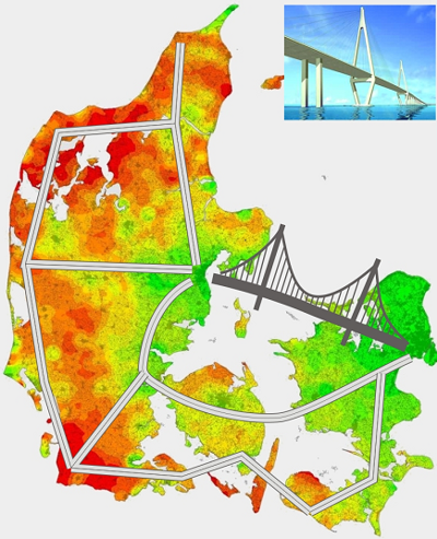
The map with the red-green colours illustrated the distribution of wealth in Denmark, green is rich, red is poor. The map is made by my colleague Jan K. Staunstrup.
Every time the map is presented to someone it releases great interest and quite often heavy discussions on relations and preconditions in the society.
If a traditional map is presented to the same people the normal reaction is something like ‘oh, that is where we went on holiday last year’.
Boring and not interesting. No, the red-green map provokes people to take a stand on what society contains. And it works, because that map they understand. The other maps they don’t understand when put in relation to everyday
Forgive me for being provocative in this article. Sometime it is needed to initiate a discussion.